Category Archives: Maps

Ezra Klein is Pessimistic about global warming.

There is an article at Vox by Ezra Klein that is well worth reading.

He has seven reasons why America will fail at global warming. If you don’t want to read this, he also has a brief video “conversation” with Te-Nehisi Coates at the top of the page in which he summarizes the points he makes in more detail in the article.

Klein’s argument is pretty straightforward. We’re too late getting started fixing the climate (if it is fixable), and our political processes do a poor job of taking on a problem that requires long-term sacrifices for less-than-immediate gains.

He does a good job, too, of showing how the Republican position on putting a price on carbon has changed radically since John McCain ran for president (and lost). McCain supported it. He also writes about why we can’t expect to engineer our way out of the problem scientifically.

All of this is pretty depressing, but he also does a good job of covering his butt at the end, saying he is pessimistic but not fatalistic. He hopes a solution will emerge.

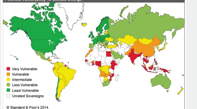
As I watched him talk with Coates in the video I realized that while Klein was limning the depths of the coming disaster, he was also painting this as an obvious problem for America. But as this map shows, while the US may produce a disproportionate percentage of the world’s carbon emissions, we also have one of the biggest cushions for absorbing climate change. It isn’t really our problem yet, unless we look further into the future.  (click to enlarge)

Screenshot 2014-09-23 09.39.36Klein quotes Matt Yglesias on this: “Very few of us are subsistence farmers. Relatively few of us live in river deltas, flood plains, or small islands. We are rich enough to be able to feasibly undertake massive engineering projects to safeguard our at-risk population centers. And the country is sufficiently large and sparsely populated that people can move around in response to climate shocks.”

So, the question becomes, how do we convince Americans to make significant changes and sacrifices when the short term threat level isn’t nearly as dire as the long term threat?

Marching felt great, we should do more of that, but we need to keep talking broadly about how the system works and why it isn’t really designed to answer this question. Maybe, I worry, we’re not designed to answer questions like this one as a species, but I’m not pessimistic. I’m pretty sure that we will hammer on this problem, as other ones, with increasing urgency. And while we talk about it and argue about it and elect public officials who recognize the problems, we’ll make progress.

Will it be enough, soon enough? I hope so.

LINK: How St. Louis County Profits From Poverty

Screenshot 2014-09-04 09.42.34One of the most important jobs of journalism is to explain the way things work. Or, in the case of St. Louis County and its many municipalities, how they don’t work. Radley Balko explains it all in this long and hugely worthwhile Washington Post story, which does a masterful job of making one feel the aggravating and humiliating context of the Ferguson demonstrations, as well as lining up a surprisingly bureaucratic and appalling series of villains.

In this case, a history of white flight, a checkerboard of self-serving municipalities that rely on legal fines to pay for themselves, and the slow development of a social culture that results in outstanding bench warrants that stifle the efforts of citizens to get a job or job training, or most egregiously, to run their own businesses.

Click the image to see the map of numbered municipalities larger. Each given its own stretch of highway from which to profit.

LINK: Explore SEFT-1

Screenshot 2014-06-26 13.50.36

The mission statement is in Spanish, which means my understanding is fuzzy, but some guys created an automobile that will run on both paved road and train tracks. Why? To explore the abandoned rail line that runs from Mexico City to the Pacific Ocean, and find out about the people along the way who have been affected.

The slide shows from the explorations are cool, with some narration that is in English as well as Spanish.

Food Maps From Around the World

jobamaPictures made from food or packaging are a favorite of mine, resonant not only with the subject but also the medium. And I really like maps. Doesn’t everyone?

A food stylist, Caitlin Levin, a photographer, Henry Hargreaves, and a typographer, Sarit Melmed, have collaborated on a series of maps of the world, each made with local foods.

Unlike this packaging portrait of President Obama, the results are quite attractive, even if the point is somewhat obscure. Surely there is more to say about Africa than plantains. More to say about the US than corn. More to say about the UK than biscuits.

So ignore the rationale. The pictures are nice and good fun. Kristin Hohenadel wrote about these, with lots of examples, at Slate.

The artists explain themselves and show their method in a video.

Time Zone Slippage Illustrated

Stefano Maggiolo explains a number of the issues involved with local time, solar time and standard clock time in The Poor Man’s Math Blog, and he created this map that highlights the areas where standard time leads solar time (green) and where it lags (red).

SolarTimeVsStandardTimeUntil mechanical clocks and faster transportation became more common in the early 19th Century, local time based around noon, when the Sun was at its highest point in the sky, was all that mattered. (click map for larger image.)

For reasons Maggiolo explains, local noon varies based on latitude and time of year. Once instantaneous communication connected localities, via telegraph at first, and soon after railway schedules, a standardized time was increasingly important. Maggiolo goes into this in brief but interesting detail.

Looking at the map, I wonder why there is so much dark red near the poles (having the sun come up later makes less difference when winter is nearly all dark and summer is nearly all light) and in China (officially, it turns out, China has only one time zone across its vast expanse).

I’ve almost always lived near the center of time zones, but have noticed that the texture of life changes when the sun comes up earlier or later. Despite our efforts to tame time, its inexorable rhythms shape our experience in often unconscious ways.

This map helps visualize at least one of those.


On The Road, With Maps and Directions

Screenshot 2014-02-10 12.39.05When I was a high schooler I was obsessed with Jack Kerouac’s On The Road. I read the novel multiple times and I read all of Kerouac’s other novels, there are many, some of them multiple times, the better to understand it and him.

I exulted when Visions of Cody, something of a companion piece to On The Road, was released, full of diary fragments and transcribed recordings of conversations between Kerouac and Neal Cassidy (Dean Moriarity in the novel), and my friend Peter and I went to a seminar at Hofstra University where a professor played recordings of some of those very conversations. At the time, just a few years after Kerouac’s death, much of his output was still hidden in the cardboard boxes of his papers and other items he left behind.

It was enough to keep a pipe of ephemera and data flowing for the forty years since, which is why I ate up the original scroll version of On The Road a few years back (truly exciting) and the “lost” collaboration between Kerouac and William Burroughs, which was released some few years ago, The Hippos Were Boiled in Their Tanks (surprising lively and moving), even though I no longer obsess over him, or the book.

My buddy Russell and I even planned on hitchhiking to Colorado for the summer following 11th grade, though our moms talked us into taking the Greyhound instead. Which was fine, because Jack often rode the Greyhound in the fellahin night of red brick sunrises, too. But once we landed in Evergreen we headed out to the Grand Canyon by thumb, dodging the highway patrol and the crazed, finding the heart of America inside the cabins of the cars and their drivers that carried us safely there and back. Just like Jack did, haunted along the banks of the Susquehanna by a shade or a memory or a portent, we found magic on the road, in whatever guise it came.

What I never thought to do was to map the actual roads Jack and Neal traversed, but it turns out just about everybody else has. Some examples.

In Kerouac’s journal is a hand-drawn map of his cross country trek.

A guy named Dennis Mansker has made interactive Google maps of all the trips in On The Road, full of odd and arresting details.

Screenshot 2014-02-10 12.47.08A guy named Gregor Weichbrodt input all the hard destinations listed in the book into Google Maps and asked for directions. The step by step routes are spontaneous prose of a distinctly mechanical perspective, but wonderful (to me) for the mere idea of it.