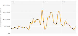
 The New Yorker came up with a clever idea. They mapped each NYC subway stop to the local median income level, and then showed it on a graph.
Manhattan wins, of course, and I’m not sure we learn any real facts from this, but it does put into immediate perspective the vast differences in the amount of money people make.
Now, next time they should index income level to subway usage.
